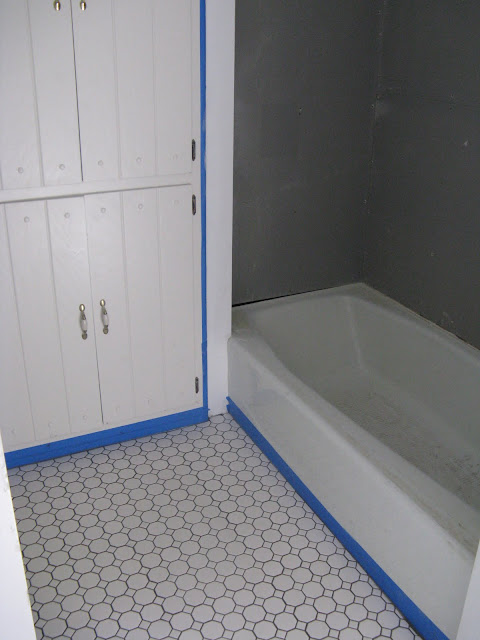
We took about a week long break from going to the house, to prepare for and travel to a family event in Oklahoma City. When we got back, John's brother came over one night to get him started on laying the bathroom floor tile. This is John's first time doing tile so it was a fun challenge (I think?) for him. He did SUPER!!!! I love love love it.
First though a few other updates....
Bathroom vanity painted a nice glossy walnut. It was hard to find a paint color that was as dark as I wanted, but it turned out perfectly!. We will be getting glass knobs for the drawers and doors. Once again, here's my inspiration for the bathroom:
When I was Googling around for vintage/Craftsman era bathroom images, two things kept popping up: subway tile, and the really small bathroom floor tiles (in various shapes and patterns). Thanks to a heads-up from my online friend Rachel, we found out these two kinds of tile also happen to be very inexpensive at Lowes! I'm totally in love with the look, and as you can see John did a superb job! He's starting the tub surround tile tonight, which will be white subway tile with a black edge, white grout.
Since we had replaced a couple doors, we also needed to buy new trim for them. While the style doesn't match any of the other trim in the house, it's what will eventually be throughout. Inspiration from this blog. John loves working with wood, and it shows!
Note the new door knobs too. I really really REALLY want glass door knobs but was sad to find out they are PRI-CEY!! So for now it's the $15 oil-rubbed bronze look from Home Depot.
Sigh, it's already started. Surprisingly, this is the work of Joseph. I didn't know he could draw musketeers so well, but apparently he can.
Today when I was over at the house briefly to get these pictures, I also took the chance to paint the bathroom wall color samples (now that I can walk on the floor). Again, keep in mind my inspiration photo above. It's from a Pottery Barn catelog and I came across it several years ago. At the time, I envisioned using the wall color in a mud room or sun room or breezeway - in other words, a small room with lots of light, and a gardeny feel where I could put lots of potted plants. I even have some greeting card prints I've been saving to frame and hang.
Since this house has no such room, I'm using the look in a bathroom after all. It fits the bill nicely though - it's the only room in the house with a south-facing window so it gets lots of light and will be perfect for potted plants. I'm thinking maiden hair fern, coleus, and a geranium for a nice small pop of color.
Anyway, here are the two colors I'd narrowed it down to. After they handed me the samples at Home Depot, with the little dots of paint on the lid, I panicked a bit. They looked much lighter and brighter than I was picturing. But so far, after putting it up on the wall, I think they're very close to what I wanted after all.
This one is called Envy, from Sherwin Williams
And this one is Grasshopper, also Sherwin Williams
Envy on the right, Grasshopper on the left.
Envy in the middle and left, Grasshopper on the right. They are veeerrry close, but Envy is a bit more bright with more yellow in it. I haven't told John which one I prefer, and when he gets back tonight he'll tell me which one he likes. But, I will tell you all - I prefer the slightly more subdued Grasshopper. I think the room has enough light to not need the extra brightness, and it's pretty much exactly what I was picturing!


I like grasshopper better too! I love the tile!
ReplyDeleteIt looks gorgeous and I love the tile too. I have to say I like "envy".
ReplyDeleteAh this is great! I love your trim! And the tile looks so great!
ReplyDelete